In 2008, Vince Gilligan created a TV series that would, if not change the face of television, teach audiences to watch and hear TV drama in a new way. A veritable film and television buff, Vince Gilligan teamed up with producer and story editor Peter Gould, cinematographers Arthur Albert and Michael Slovis, sound designer Edmond J. Coblentz and supervising sound editor Nick Forshager, and together they would create the look and sound of Breaking Bad (AMC, 2008-2013). This article revisits Breaking Bad and the prequel Better Call Saul (AMC, 2015-present), trying to explain how and in what sense they gave television a new look and sound. Hoping to answer those questions in a satisfying way, I approached Albert, Coblentz and Forshager, asking them to dissect specific scenes and sequences from the shows and to give me the keys to unlocking Gilligan’s signature style.
Big Sound on the Small Screen: The Sound of Breaking Bad
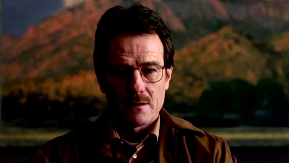
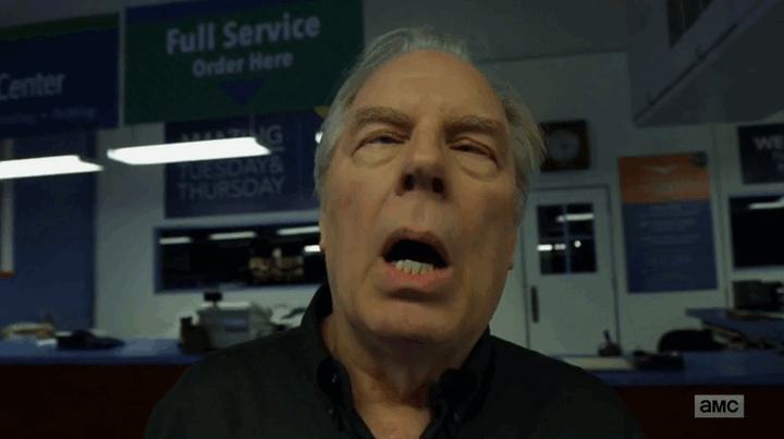
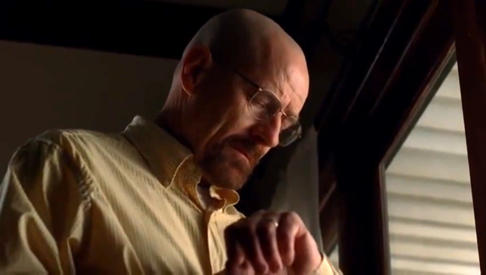
It has been a long day. Working two jobs, trying to support his family and to make ends meet, he is stuck at a garage, doing over-time. And then it happens. A car arrives, and in the background of the shot we see an attractive woman, from his point of view, and as we cut back to him, the sound seems to indicate that something is wrong. Is he attracted to her? Will this be the beginning of an extramarital affair? The viewer immediately conjures up a number of theories and hypotheses, but as the man collapses, we realize that something else is going on, something else entirely. This scene, at Bogdan’s garage, is an iconic part of the pilot episode from Breaking Bad, and what follows is, sonically, one of the most striking scenes ever to be experienced on the small screen. The man, Walter White (Bryan Cranston), is brought to a hospital, and the camera now tilts upwards, slowly revealing Walter’s situation and whereabouts. Walter is at the hospital, and as the camera tilts, the muffled sound of the doctor gives us an immediate sense of Walter’s state of mind. The scene proceeds to show us a dialogue between Walter and the doctor, but the doctor’s words are inaudible, slowly giving way to a high-pitched, tinnitus-like sound. The doctor, gradually becoming more intelligible, looks at his patient. “You understood what I just said to you,” he asks, and in a detached, almost robotic manner Walter replies: “Yes. Lung cancer. Inoperable” (fig. 1).
“The pilot started, obviously, with Vince Gilligan’s vision of the thing,” Nick Forshager says, “and he had a very clear-cut idea from the script of what it was going to look and even sound like.” Forshager continues,
when I came, it had a very detailed description in the script – some detailed descriptions of the flapping pants in the beginning and the different signature sounds of the show, including the tinnitus sound which we used for Walt. It starts with Vince’s vision, and then we try to create sounds and images that will fit his vision.
I thought this would be like any other regular show where they’ll put the music on, and that is it, but he said, “No,” and we built the sound design very organically. Vince is very open-minded, if you come in with an idea and you can express it. So it becomes very collaborative. It’s great with someone who has a vision, but it is also great to have a showrunner who is willing to listen and collaborate, and Vince is like that.
The tinnitus-like sound was created by sound designer Edmond J. Coblentz, and, as he explains, they wanted it to be a dynamic sound that could illustrate Walter’s sense of detachment and his inability to deal with his diagnosis:
That was designed by me specifically for Walter. When we did that particular scene, we talked about the MRI machine, about the sounds inside the scene. But what we came up with more importantly was what Walt was feeling. And it shouldn’t be music. The tinnitus sound came from a combination of elements – some were from the library – and I think I might have had three stereo pairs and played them with one mono pair to get that sound you hear. We used a tuner, and somehow we came up with that sound. It wasn’t a simple mono sound; there was some fluctuation in the frequency. It’s an interesting sound.
Different sounds, different subjects
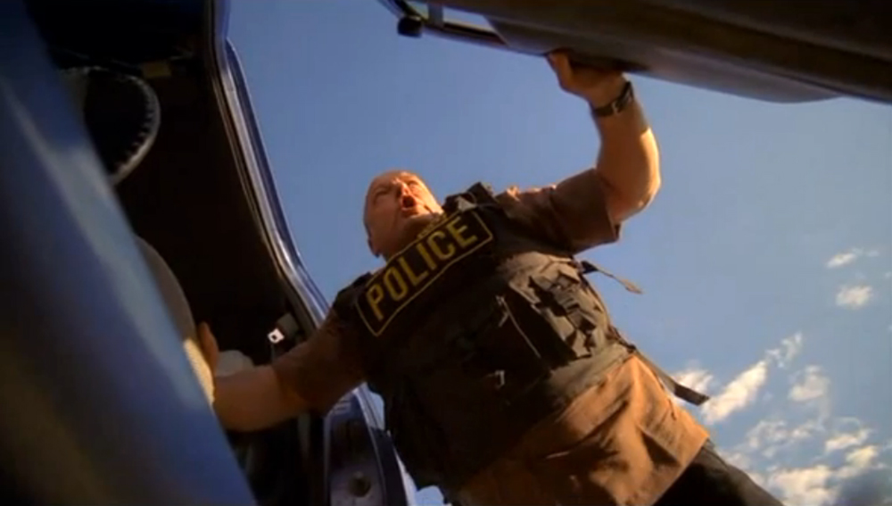
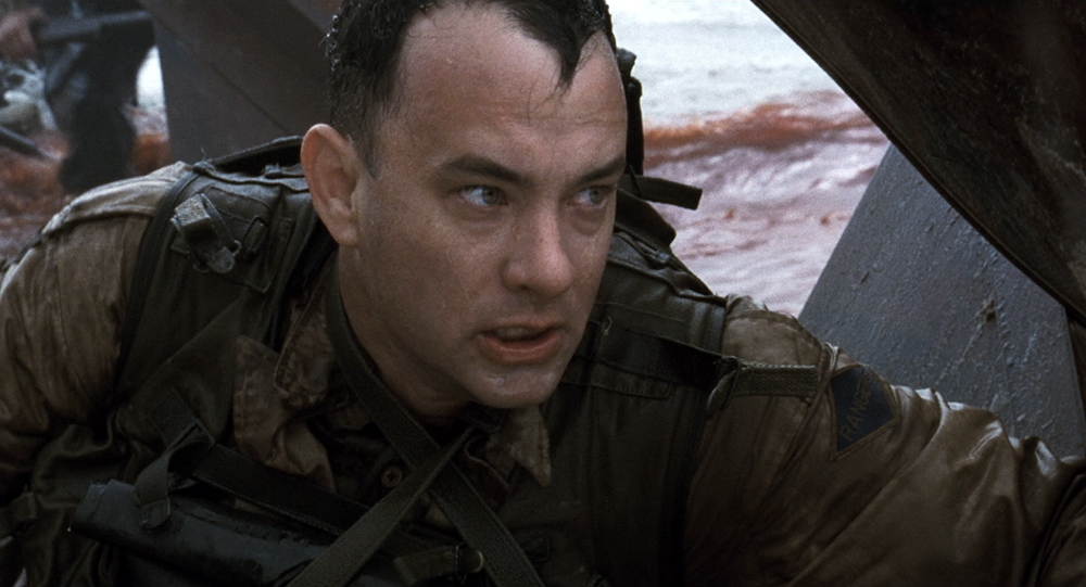
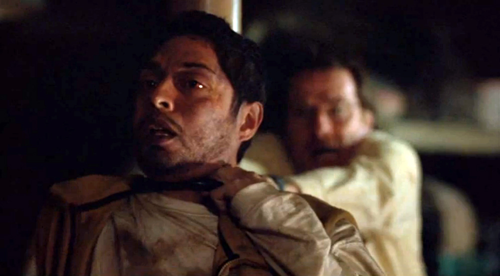
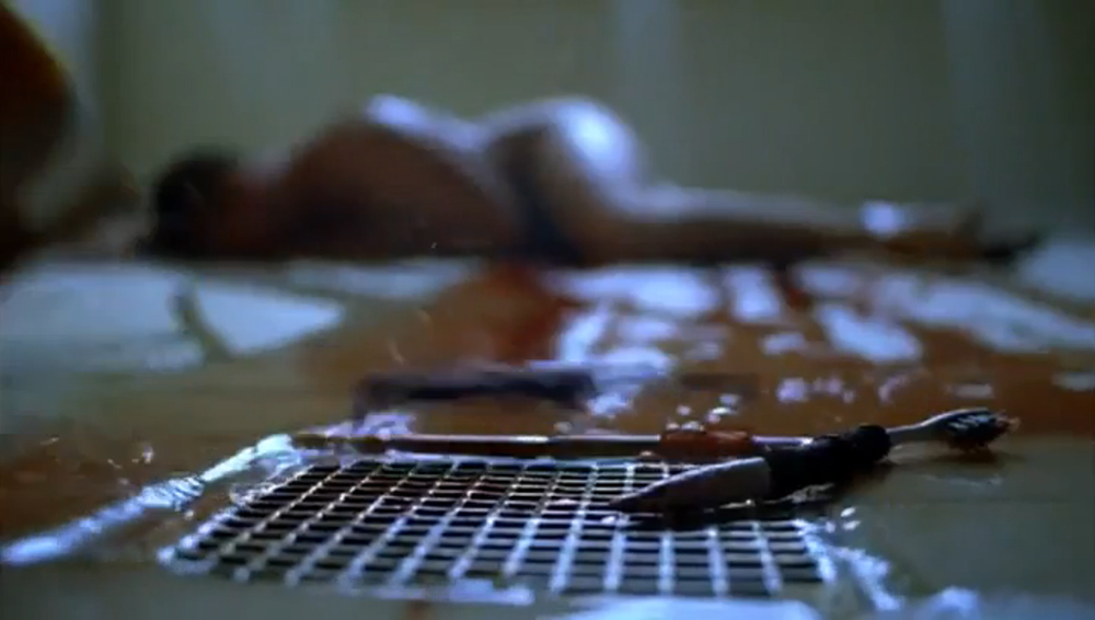
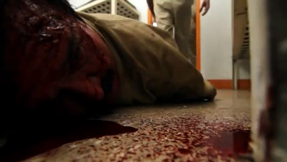
When seeing both Breaking Bad and Better Call Saul, the viewer might notice the recurring use of subjective sound in both series. Apart from the tinnitus sound in the pilot episode, an expressive compilation of noises is used to illustrate Hank’s state of mind in the episode “Negro y azul,” as he, Walter’s brother-in-law, sees a severed head on a tortoise and experiences a kind of shell shock. That scene is sonically reminiscent of Saving Private Ryan (1998), and it illustrates Gilligan’s predilection for expressive and subjective sound, while exemplifying the amount of sonic detail and variation in the series (fig. 2-3).
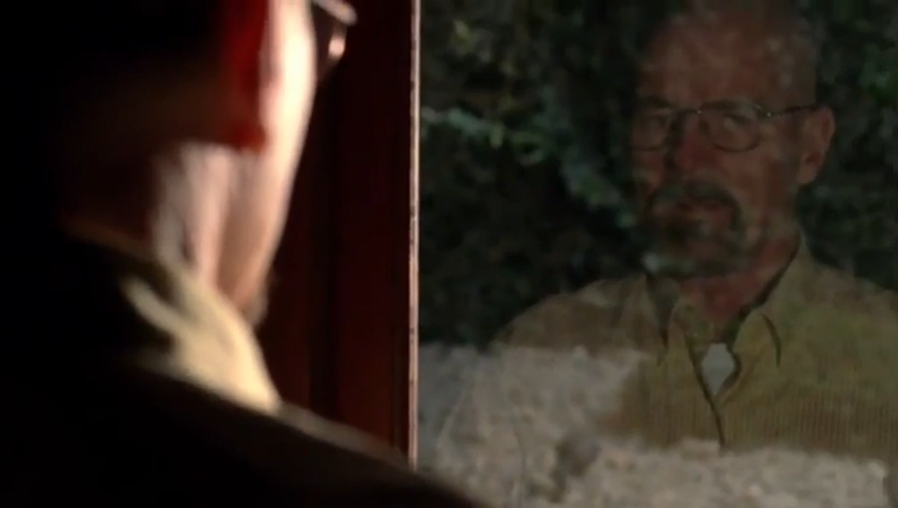
In Better Call Saul, then, we are dealing with a character named Chuck (Michael McKean) who experiences a number of panic or anxiety attacks, and to illustrate those attacks, Gilligan uses snorry-cam, subjective camera and subjective noise, in yet another variation (fig. 4). As Forshager puts it,
Walt always had that tonal tinnitus thing when he was injured or something like that. We always came back to that tinnitus thing which we saw at the doctor’s office in the pilot. And then there is an episode where Hank experiences shell shock, and we had to do it in a different way which would fit Hank, and which would make it different from the signature tinnitus sound that we used for Walt. And when Chuck experiences a similar thing in Better Call Saul, it is much more electronic because of Chuck’s fear of electricity. Especially in the second season where Chuck is in the printer room, it took on a different and very electronic sound. It is interesting that you mention that it seems as if the electronic sounds mirror Chuck who is, himself, short-circuiting because that is exactly what Peter Gould said. He said that Chuck is short-circuiting, he is coming undone, and we wanted the sound to illustrate that.
Sonic Hints and Leitmotifs
As seen above, the use of subjective sound is prevalent in Breaking Bad and Better Call Saul, and Gilligan, Coblentz and Forshager use different kinds of subjective noise for the different characters, thus hinting at their different personalities. In fact, sound is often used to illustrate qualities within the different characters (almost as if we were dealing with leitmotifs in an opera or an epic movie), even in scenes that are not strikingly subjective.
In the episode called “… And the Bag’s Out of the River,” there is a sequence where Walter White kills Krazy 8 in his basement, in what looks like an almost Freudian or Jungian motif. In that sequence, different noises are used in a very suspenseful way. We have the clanging sounds of a plate in the beginning, as Walter recognizes that a part of the plate is missing and that Krazy 8 might be planning to kill him, and there are lengthy stretches of what Hitchcock would call ominous silence. As Walter descends into the dark cellar, then, the scene suddenly erupts in a series of close-up sounds and shuffling noises, as Walter chokes his hostage with a bicycle lock (fig. 5).
Afterwards, there is a brief black-out, before we cut to a bright day where we can hear sprinklers on the lawn and birds chirping, as if to illustrate the difference between the dark underbelly (the repressed actions that have just taken place in the cellar) and the beautiful veneer of suburban America (fig. 6).
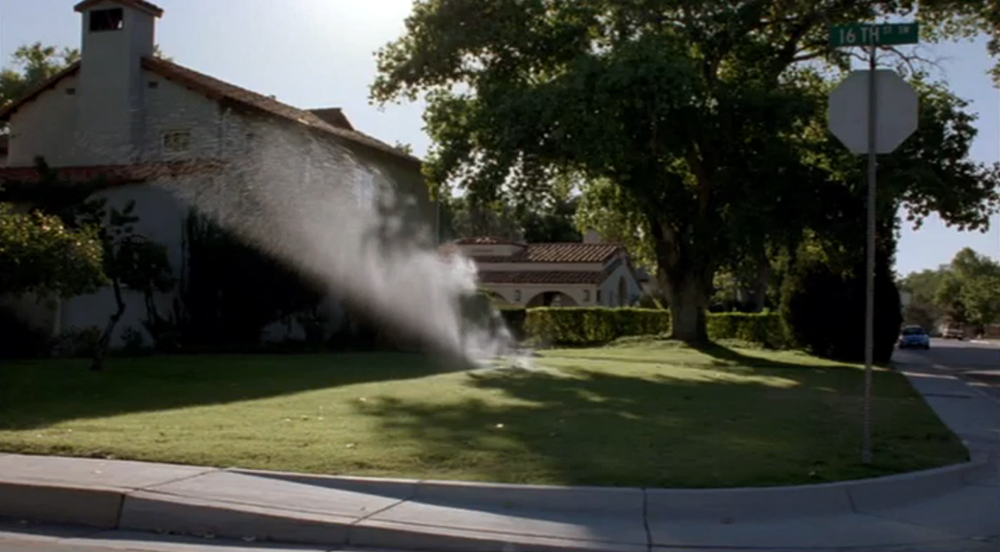
“The house and the sprinklers were important to give us a contrast,” as Edmond J. Coblentz says. “We tried that on a daily basis – to get that contrast.” And he continues,
We were trying to give the audience a crescendo of fear, and then, suddenly, as we cut, the sun comes up, and the fear is gone. We wanted to illustrate the double life that Walter is leading and the difference between the beautiful surface and the dark underbelly.
Originally, the studio wanted the sequence to include non-diegetic music, as Nick Forshager says, but realizing the suspenseful and psychological potential of the sound itself, they ended up accepting the original mix without music. As Forshager puts it,
That is one of my favorite sequences, and that was when we knew that we were doing something else than regular television. There is a kind of backstory to that sequence. Vince works in a different way, in that he does not use temp music. If there’s music and it’s in a montage, that will be in, but otherwise there will be no music. So we heard that sequence, and we got to see it stripped down, and there was actually a lot of suspense in there already. Therefore, we decided that we wanted to build suspense without using music, but using pauses and small sounds. The basement would have this ominous sound, and we wanted more rumble and tension as we went along, especially with the clanging sound of the bicycle lock. But when they sent it to the studio, they said it needed music. We ended up using my mix, and Vince loved it. So when the executives came by, they saw our version, and they asked to see it with music, but they ended up agreeing that my version was better.
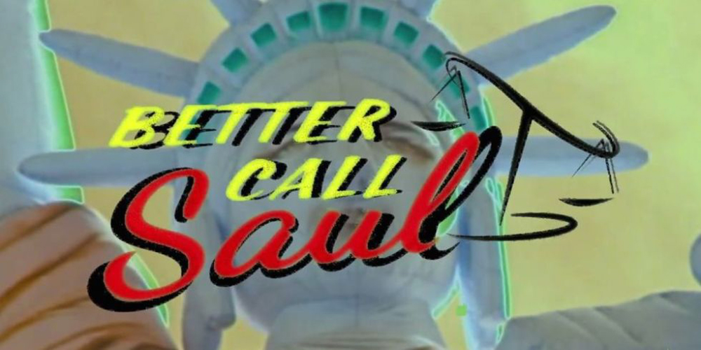
The title sequence of Breaking Bad was striking in its intense, symbolic brevity, but the title sequence for Better Call Saul, especially in terms of sound and music, was even more striking and avant-garde. Full of visual glitches that differ from episode to episode, the opening of Better Call Saul ends abruptly, in the middle of a musical note. It seems sloppy and unfinished (fig. 7). That look and sound, however, was an intended aesthetic on the part of Vince Gilligan, and as Nick Forshager says it was meant to mirror the protagonist Jimmy McGill’s tendency towards cutting corners. In the words of Forshager,
I am happy you mention that title sequence. A lot of people think it’s a mistake. “Why is the music cut off that way?” But it was very intentional, and, as you say, it was supposed to mirror Jimmy. It’s not perfect, not polished, exactly like Jimmy. We struggled to find the music for the title sequence, and it was the last piece we ever found. We actually had an extension of it where it ended, but we wanted to cut it off, and we didn’t want it to be elegant.
Also visually, the title sequence was supposed to look grainy and imperfect, as the cinematographer, Arthur Albert, puts it, and the visual style, too, was meant to mirror the dubious character of would-be-lawyer Jimmy McGill (Bob Odenkirk). In Albert’s words,
I know Vincent and his co-writer and co-producer loved the look of old tube-TV with the bars and where the colors are bad. They wanted the title sequence to be reminiscent of the first color TV shows that were made in the early days of television drama. And they wanted the visual style to fit Jimmy.
Montages and Counterpoints
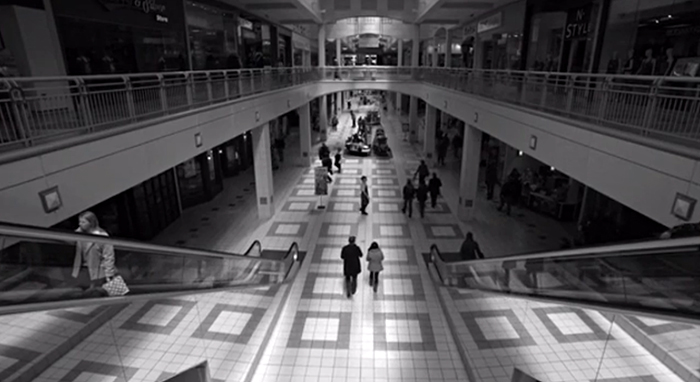
Apart from the use of suspenseful sound, sonic contrasts and subjective noise, Better Call Saul and especially Breaking Bad are known for their vivid montages that often include contrapuntal, non-diegetic music and raw, punctual noises. A particularly noteworthy example is taken from the episode “Gliding Over All” where we see Walter White looking at his wrist watch, waiting for different people – potential threats – to be killed off by some hired hands (fig. 8).
The Godfather-like montage is reminiscent of Vsevolod Pudovkin who, when trying to describe the potential functions montage editing, uses a hypothetical example with a watch. “The watch on the wrist of the callous brute,” writes Pudovkin, “connects him with […] the tragic dénouement, thus ever present in the consciousness of the spectator.” (Pudovkin 2009 [1926]: 13). The wrist watch, in both Pudovkin’s example and the episode from Breaking Bad, gives us a sense of parallelism and simultaneity: All of the killings take place at once, within a short time frame, and that illustrates the growing cynicism on the part of Walter (fig. 9-11).
The montage includes different shots of prisoners being killed in various clinical and morbid ways, and the use of high-contrast imagery and low-angle shots clash with the slow tempo and low-key lighting of the opening (where Walter is looking at his wrist watch) and the non-diegetic song, “Pick Your Self Up,” performed by Frank Sinatra. As Forshager puts it,
In every montage, we try not to do the same thing over and over again. There are times when we have a montage, where I think we don’t need sound here. And then there are examples like this one where it’s kind of a symphony, and my job was to be the in-between, somewhat like a percussion instrument, so we added these bits of sound. We picked up these small sounds – a stab, a fall, a watch – that could help tell the story, so it became punctuations in a way, and the music would be a contrast that would make the images look even more heinous. That is one of my favorite montages of the entire show with all those small sounds and the music that just adds this great contrast to the picture. It’s very Scorsese-like, in a way. We can find many references like that, but Vince will always do it in his own way. When he comes up with something, it might look like something we have seen before, and he might borrow different elements from other films, but he turns it into his own. This particular montage always reminded me of Scorsese because of the music choice, but it is its own thing.
Annoyingly avant-garde
When thinking of Breaking Bad and Better Call Saul, we often recall the montages, the contrapuntal music, the high-contrast imagery, the weird point of view shots and the expressive sound work, but, in fact, the most art-like episode in Breaking Bad is characterized primarily by its lack of music, expressive colors and noise. Kristin Thompson (2003: 171) once pondered the question, “can there be art TV that airs on the mainstream networks,” and while Breaking Bad and Better Call Saul are not network shows, Thompson would likely be surprised, if she saw the episode called “The Fly.” In that episode from Breaking Bad, nothing much happens, and the rapid editing and noticeable choices of framing and angles that we usually connect with the show give way to a style consisting of long takes, long stretches of quietude and inaction (what the Nouvelle Vague directors would called temps mort). According to Nick Forshager,
When they brought that to my attention – that there’d be an entire episode of a fly – I was scared, and I don’t think there’s any music in that episode. There’s the sound of the fly and the lab. You don’t even have the sounds of the machines or the music. What we ended up having to rely on was the fly sound, having enough of it that it would annoy the audience, and then we would build suspense using small sounds of ladders etc. It was conceptually very difficult to make, it was a real challenge. And then story-wise it didn’t really say much – it moved forward one little ounce in 40 minutes, but that move was huge in a way – and I think we pulled it off. It was difficult to do, having to rely on the sounds of the lab, the fly and different objects to create enough suspense to make it interesting. Some people hated that episode, but I am happy they did it, and I think it was a testament to how different this show was from regular television.
Forshager links this to the general changes in television during the last two decades,
The nature of television has changed a lot over the years. There have been pockets of shows in the past that were very cinematic, Twin Peaks and The Sopranos for example, but Breaking Bad was one of the first shows to be told from beginning to end in a very cinematic way. The cinematography, the sound, the music and the editing – if they help tell the story in a very cinematic way, Vince will use it. Now, we are used to a totally new type of television – television telling stories in a very different, cinematic way, and it’s really exciting stories. We see that in shows like Stranger Things and Mr. Robot, just like in Fargo and Better Call Saul.
Gilligan’s Visuality, Gilligan’s Vision
Visually, the shows are also full of contrasts and clashes: There are high-contrast, saturated colors and toned down black and white sequences, beautiful high-key lighting counteracted by noir-like low-key lighting, extreme close-ups and extreme long shots, and jerky handheld camera as opposed to the lengthy, static camera work of Better Call Saul. Being a prequel to Breaking Bad, Better Call Saul is also stylistically linked to the original show, and framing-wise and sonically there are many similarities. However, the two series are also vividly different, inasmuch as Gilligan wanted Better Call Saul to relate to the ‘mother show’ without inheriting an established look and tone. According to Arthur Albert,
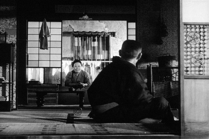
When Vince and I met on Better Call Saul, I asked him whether he wanted the same look as in Breaking Bad, and he told me, “No, I want it to look like nothing you have ever seen on television.” First of all, we wanted Saul to be in the worst possible place he could be, for us to see how far he has fallen, so the opening sequence had to convey that. Stylistically, one of the things we wanted to do was that we wanted to move away from the handheld style of Breaking Bad. Breaking Bad used a lot of handheld camera, which gave it this nervous feel. Better Call Saul is much more static, and it had a much more old style, unlike most television shows where cameras will often move in order to create a certain dynamic. I was inspired by Ozu in his use of angles and static camera. When the camera moves in Better Call Saul, it moves with the characters. We did not want movement for the sake of movement.
The other stylistic departure was Vince’s approach to comedy. I have shot a lot of comedy shows, and they usually want to show the viewers everything, the actors and their punchlines, and we did not want to use that style in Better Call Saul, even though it is a comedy. Vince Gilligan would often say, “We know who the characters are. We don’t need to see them all the time,” so the characters’ faces would often fall into half-light or silhouettes. Something you would rarely see on traditional television where they often want us to see the stars. The story in Better Call Saul is a comedy, but it also has noir elements, particularly introduced by the character Mike, so it is a blend of a noir-like style and comedy. Vince really encourages you to push the limits: There are entire scenes shot in long and extreme long shots, and you very rarely get encouraged to do that in television.
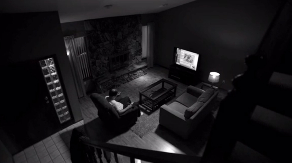
Albert points to the shift in style from Breaking Bad to Better Call Saul, specifically in terms of lighting choices and pacing, and he refers to the opening sequence where we see Jimmy McGill working at a Cinnabon and going home to his lonely and noticeably quite living room. As Albert says, the use of black and white as a stylistic choice was meant to differentiate Better Call Saul from Breaking Bad (fig. 13), but it is also a playful choice in terms of narration because we naturally think of it as a flashback, even though it might be a flashforward. Is this where Jimmy started, or is it a glimpse of the show’s tragic ending?
Visually, the most striking choice of Better Call Saul, however, is the extreme use of low-key lighting, and especially the scenes at Chuck’s house are darker than you would naturally expect from a TV show (fig. 14).
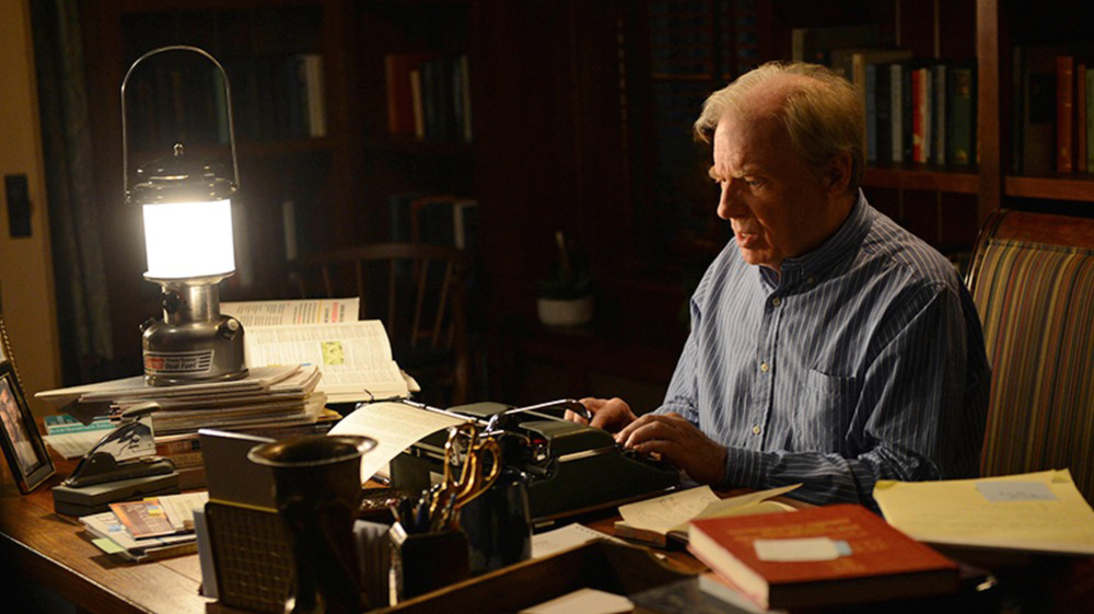
In those scenes we are closer to the visual design of classical noir films like The Big Combo (1955) or neo- and future-noirs like Blade Runner (1982), and, in fact, Blade Runner is one of the primary stylistic influences on the show. As Albert says,
The brother’s house is very difficult to shoot because there’s no electrical light. Usually you would hard-light everything in those scenes. But we did not do that. Most of the night scenes are lit only by the moonlight or a street light, so it’s the lamp in the scene – we made our own LED lamp because it is too dangerous using a gasoline lamp – that lights the characters. Nothing else. They wanted it to look like Blade Runner. Had I known that before we started shooting, I would have asked for a building with tall windows. But I used Blade Runner as my inspiration when doing the scenes at Chuck’s house.
That lighting technique could not have been done in the old days of television. The transition from analog to digital was huge. In analog, every TV set was different, so you had to play it safe and make it brighter, otherwise many people wouldn’t be able to see anything. With digital it is much sharper with a better dynamic range, and it will come across the way you want it to on most people’s TV sets.
Vince Gilligan exploited new techniques and technological possibilities when creating Breaking Bad and Better Call Saul, and he is recognized as a very specific and detail-oriented showrunner.
In relation to the sound design, Edmond J. Coblentz says that they used 32-48 tracks on Breaking Bad, which is far from a traditional television show, and Gilligan would spot the show with the sound crew describing exactly how he wanted things to sound:
What we did was to spot the show with Vince Gilligan, and as we spotted the show, he would describe the sounds – what Walt’s car, Krazy 8’s low-rider or the inside of the house with the bath tub would sound like – and every time we had liquids or something burning or acid falling on the floor we were asked to do it over and over again. It had to be very specific for Vince. He didn’t want boiling water to sound like boiling water. He wanted to sell that these guys were cooking drugs. It should not sound like your mom cooking in the kitchen. It should be more dramatic and evil, in a way.
The same, then, could be said of the visual design, and Arthur Albert vividly recalls the first meeting with Vince Gilligan and Peter Gould about Better Call Saul. At that meeting, Gilligan and Gould showed Albert some stills from old movies, illustrating that they wanted a cinematic look on the show and that they had some very specific thoughts on the visual design. What it should look like and what the template should be:
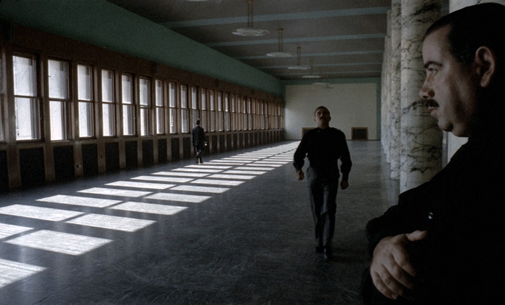
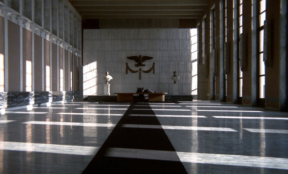
It’s funny. I’ve always loved Vittorio Storaro. I’ve always loved his work, his unique visual aesthetic. And when I sat down with Vince Gilligan and Peter Gould to talk about Better Call Saul, they showed me some stills for inspiration. Some stills were from Kubrick, especially his vanishing point perspective shots. And, I mean, who isn’t a fan of Kubrick? But some of the stills were from The Conformist where they showed me some strange and untraditional off-balance compositions. And I was thinking that they were showing me images from some of my favorite cinematographers. But then I asked Vince Gilligan, “You want it to look like The Conformist, so why are we not shooting in Rome?” We were not shooting in Rome. In fact, we were shooting in Albuquerque, which is one of the ugliest cities that I have ever had the misfortune of visiting, and we did our best to make it look as aesthetic as possible.
Vince Gilligan is a brilliant writer and showrunner. One reason for the success of Better Call Saul and Breaking Bad is Vince’s almost obsessive attention to detail. He is very involved in every detail. From time to time, that makes it difficult to work on one of his shows because he is so involved in everything, but that is also the reason why it is so cohesive and distinctive. It is his vision.
It would be fair to argue that Breaking Bad broke the mold of American television drama, but Better Call Saul managed to be cohesive with its ‘mother show’ while breaking new ground. Revisiting the audiovisual design of those two shows, proves to us that they were both visually and sonically innovative, employing a range of different techniques – low-key lighting, high-contrast images, montage editing, contrapuntal sound, subjective noise, conspicuous point of view shots, low angles and long, static takes – but they employed all of these elements in a way that seems strangely organic. Both shows, it seems, are about the contrasts of American society, and they illustrate that theme by giving us nuanced, double-sided characters and audiovisual contrasts and counterpoints. If ever there was such a thing as “art TV,” this might be it.
Facts
Literature
- Pudovkin, V.I. (2009 [1926]), “On Editing”, in Braudy, Leo & Marshall Cohen (eds.), Film Theory and Criticism, Oxford: Oxford University Press, pp. 7-14.
- Thompson, Kristin (2003), Storytelling in Film and Television. Cambridge, MA: Harvard University Press.